Rhône Studio
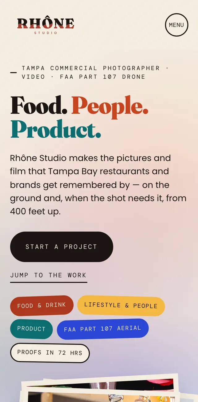
A site for a Tampa commercial photo, film and drone studio, organized around what clients actually hire for.


The problem
A photo and film portfolio has the opposite problem of most sites: too many strong images and no order. Scroll a wall of pictures and a visitor leaves without understanding what they can actually book.
What I did
Organized by hire, not by date
Food and drink, product, people, aerial and film, split around the hiring decision instead of chronology, so a restaurant owner can go straight to the food page. The four photo and aerial categories each get their own page: how the shoot runs in four steps, what gets delivered, and a FAQ.
Led aerial with the license
Part 107, stated up front, the first thing a commercial client has to confirm before they can hire drone work. Insurance and airspace sit beside it on a flight card, and on desktop an altimeter down the side climbs from 0 to 400 feet as you scroll.
Framed it like prints
Photos sit in cream-bordered, slightly tilted print frames. Galleries start short, expand on request and open in a lightbox, so the eye gets somewhere to land instead of drowning in an endless scroll.
Kept it heavy but fast
Portfolio sites die on load time. Images are sized for each screen, the looping clips wait until they're needed, and the YouTube films load nothing until someone presses play.
Turned the rate card into a brief
No published prices. Each service page offers the rate card, and that link opens the project form with the service already filled in. The form asks for the shoot date, budget range and brief up front.
The result
A site structured around what people hire for, with every service page pointing at the same project form, and the working reference for the photography that goes into every other project here.
Need a portfolio like this? Start with Tampa web design.
Ready to build elsewhere?
Tell me what you need and what a win looks like. I'll come back within one business day with scope, price, and timeline.
Request a quote