Fat Tail, the site
The marketing site for the Fat Tail weather app: a live try-it tool, the full feature story, and a plain-language pitch for measured weather.
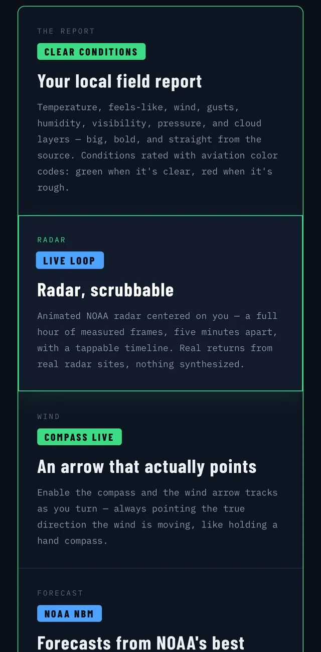
The problem
A weather app needs to explain, in one scroll, why it's different from the dozen free apps already on a phone, and prove it before anyone taps download.
What I did
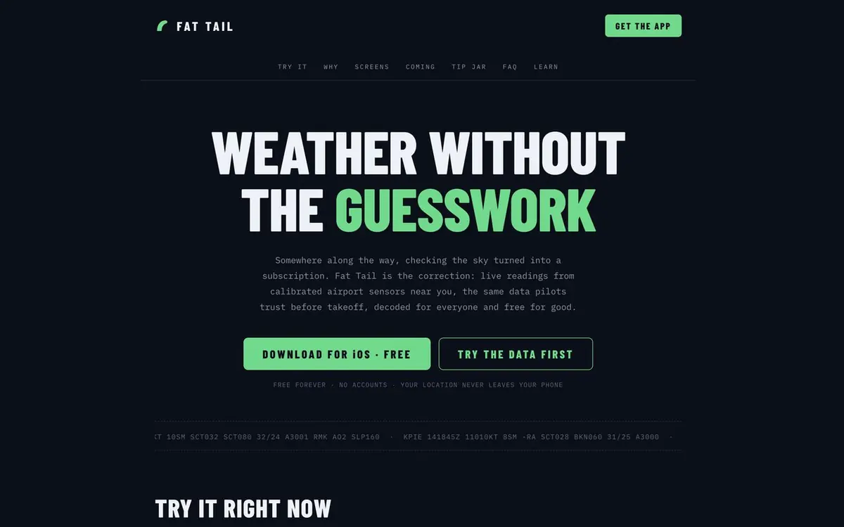
Led with the one-line difference
Straight from airport sensors, the same data pilots trust, the credibility hook that separates it from consumer weather apps before any feature list.
Made the value provable now
A working try-it tool: type a US ZIP and pull a live field report from the nearest airport sensor, so visitors feel the product before they download anything.
Told the full story
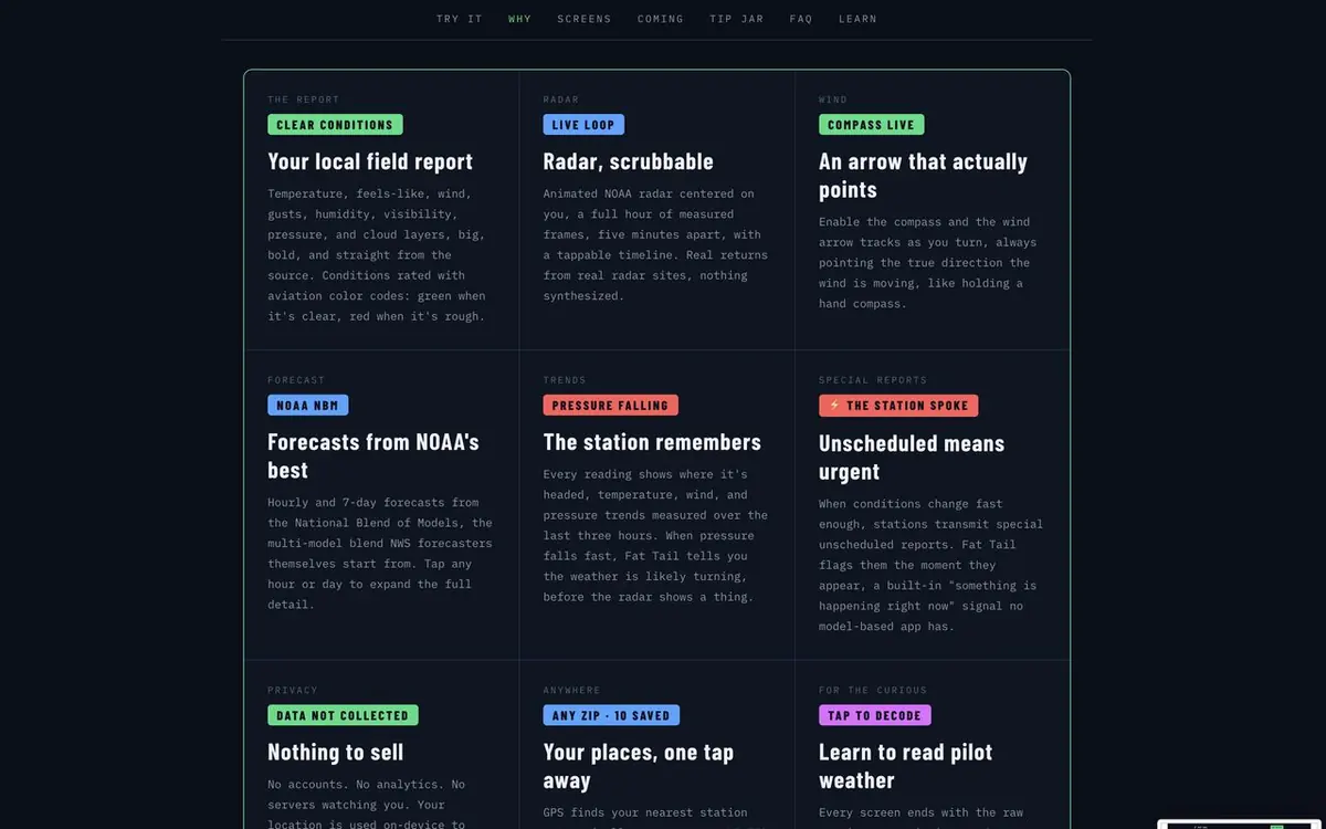
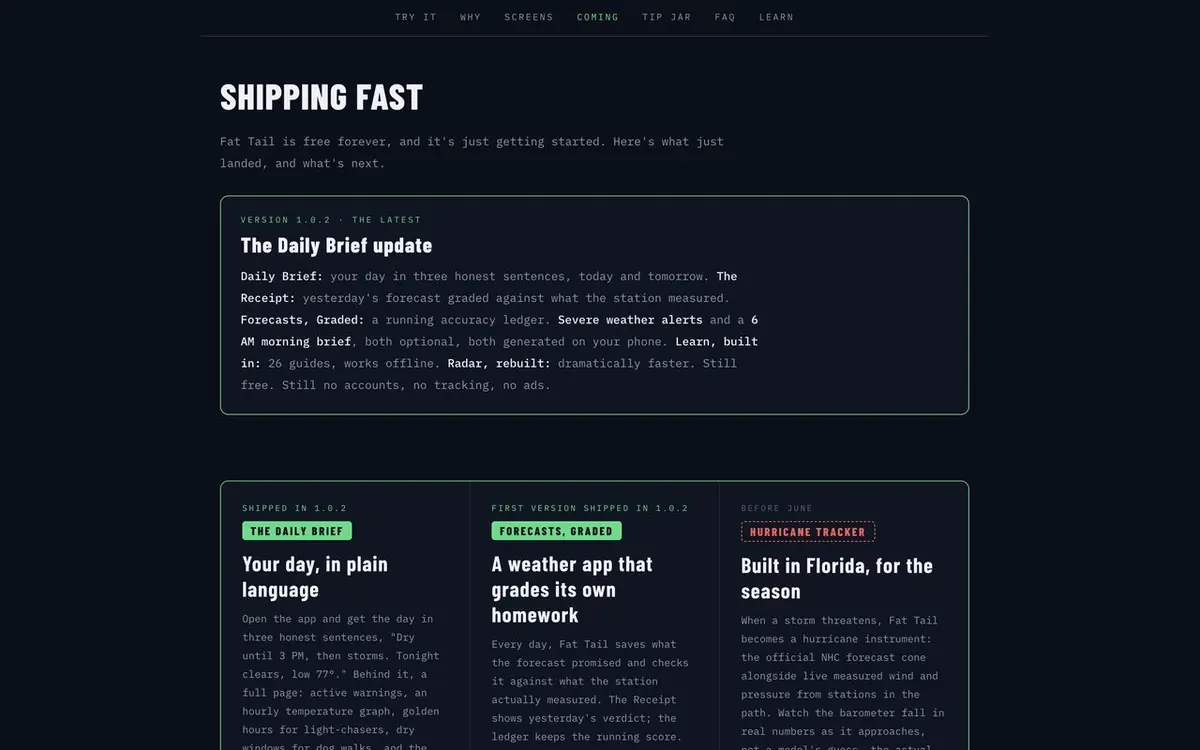
Every feature laid out with real screens, the field report, scrubbable radar, the wind compass, pressure trends, plus a roadmap and a plain-language FAQ that answers what people actually ask.
Built a learn section
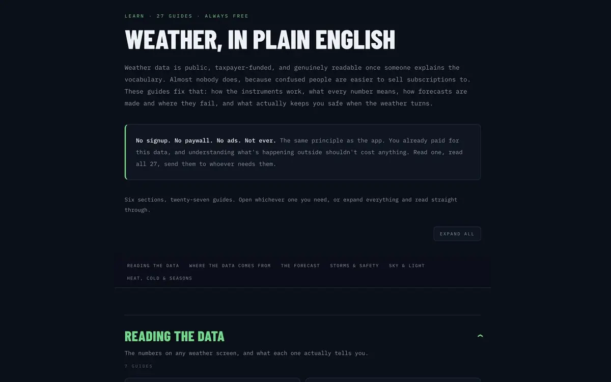
Free guides on reading a METAR, dew point, and pressure trends, the same tap-to-learn idea as the app, which also brings in search traffic.
Matched the app's voice
Site and product share one design language, dark like a cockpit display, so the eventual download feels like the thing the visitor already saw.
The result
A marketing site that proves the app's value with a live tool before launch, tells the whole story, and gives measured weather a front door, and a front door for the app now that it's live on the App Store.
Need a site that sells an app? Start with Tampa app development.
Ready to build elsewhere?
Tell me what you need and what a win looks like. I'll come back within one business day with scope, price, and timeline.
Request a quote